
The way people access the internet has fundamentally changed. Data consistently shows that over half of all global web traffic originates from mobile devices. This trend isn’t just a preference—it’s the primary way people consume digital content, including your surveys.
In the world of feedback and data collection, this means one thing: your digital strategy must be mobile-first.
What Exactly is a Mobile-Optimized Survey?
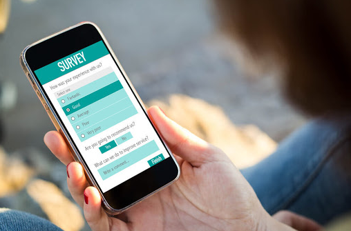
A mobile-optimized survey is one specifically designed to provide a seamless, enjoyable user experience when completed on a smartphone or tablet.
It is more than just a desktop survey that fits a small screen; it’s a questionnaire engineered to adapt its design and functionality for a touch-screen interface, ensuring maximum accessibility and minimal friction.
Key Characteristics of Optimization:
- Responsive Design: The layout automatically adjusts text, images, and input fields to the device’s screen size and orientation.
- Touch-Enabled: Buttons and selectors are sized appropriately for accurate tapping, replacing the need for precise mouse clicks.
- Legible Text: Font sizes are enlarged for effortless viewing, reducing strain.
Why Mobile Optimization is Critical to Your Data Quality
If your survey is not mobile-optimized, you are actively jeopardizing your research success. When a user encounters a poorly designed mobile survey—one with tiny text, difficult navigation, or mandatory horizontal scrolling—they will likely abandon it immediately.
This failure directly results in:
- Lower Response Rates: You lose a massive segment of your potential audience.
- Biased Data: If only desktop users complete the survey, your results may not accurately represent your entire customer base.
- Increased Survey Fatigue: Difficult navigation leads to frustration, resulting in rushed or inaccurate answers from those who do complete it.
The 10 Commandments of Mobile Survey Design
The key to a successful mobile survey is reducing effort, increasing readability, and prioritizing speed. Use this checklist to optimize your next questionnaire:
Design & Layout
- Keep it Simple and Short: Limit your overall questionnaire length. Ideally, target 5 to 10 questions for quick pulse checks, acknowledging that you are likely interrupting the user on the go.
- Prioritize Vertical Scrolling: Mobile users are conditioned to scroll down. Avoid unnecessary page breaks between questions, as forcing a user to press “Next” multiple times creates friction.
- Minimize Visual Clutter: Use a clean, distraction-free interface. Reduce the size of logos and branding elements to maximize space for the questions and answers.
- Avoid Columns: Never use multiple columns for answer lists (e.g., side-by-side radio buttons). This forces text wrapping and makes selections difficult. Stack answers vertically.
Question & Input
- Use Concise Wording: Write short, straightforward questions that are easy to absorb on a small screen. Get straight to the point.
- Limit Open-Text Questions: Open-ended questions require typing on a small keyboard, which takes longer and reduces convenience. Use them only when absolutely necessary for qualitative depth.
- Avoid Unnecessary Drop-Downs: On many mobile operating systems, drop-down menus require three separate presses (tap to open, tap to select, tap to confirm). Use radio buttons or card-style selections for quicker input.
Technical & Testing
- Optimize Image Files: Ensure any images used are correctly sized for portrait screens and have small file sizes. Large images force horizontal scrolling and slow page loading, which is fatal on a weak cellular connection.
- Ensure Finger-Friendly Inputs: Design answer buttons (radio buttons, check boxes, sliders) to be large and adequately spaced for accurate touch interaction.
- Test, Test, Test: Always perform quality assurance (QA) on multiple common devices (iOS and Android smartphones and tablets) before launching. This guarantees functional and visual consistency.
By embracing a mobile-optimized approach, you are not just accommodating a trend—you are adopting a strategic mandate that ensures robust data collection and a positive customer experience.